> ## Documentation Index
> Fetch the complete documentation index at: https://docs.make-pretty.com/llms.txt
> Use this file to discover all available pages before exploring further.
# Icons
> Search an icon library by meaning, and insert vectors recoloured to your master palette.
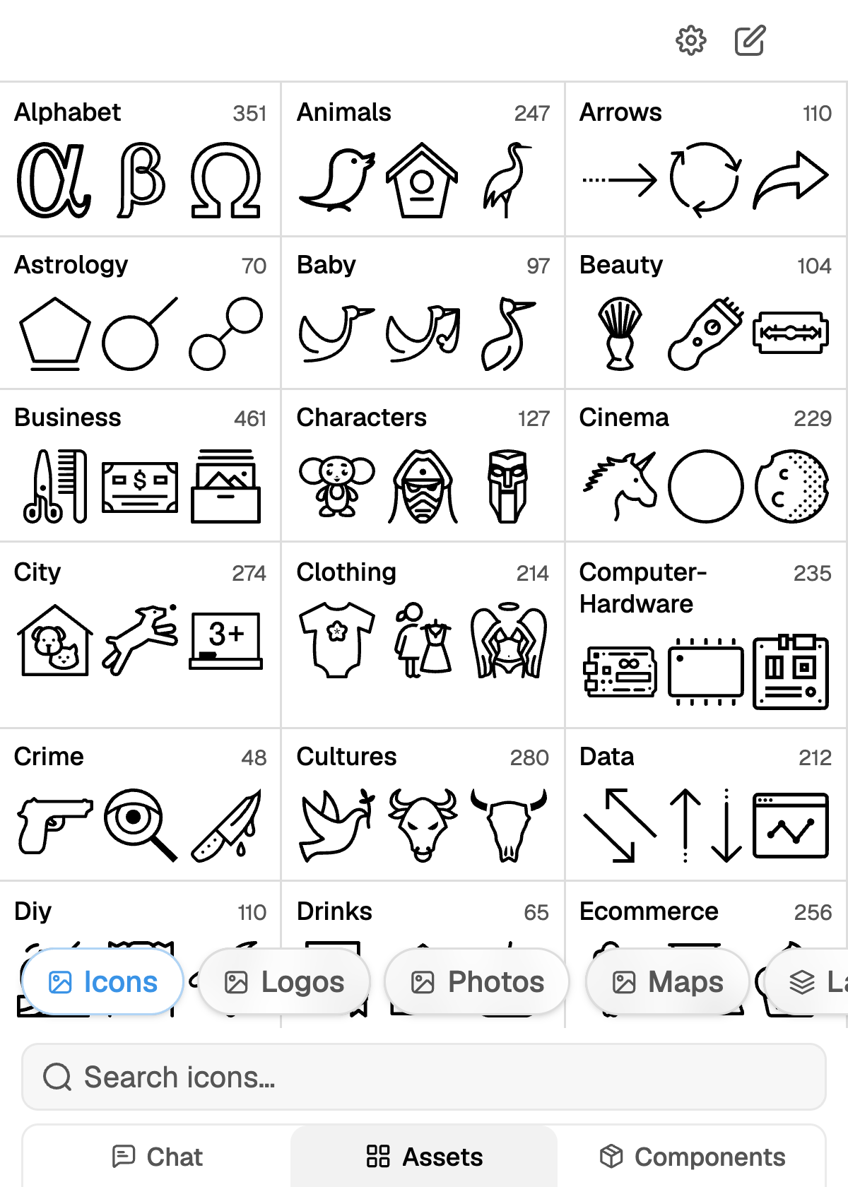
Open the **Assets** tab and pick **Icons**. The library opens on categories; drill into one, or type
into `Search icons…` to search the whole library at once.
 Icons come in outline, solid and duotone styles. They insert as vectors, recoloured to your master
palette and snapped to the deck grid, so you can select, restyle and resize them like any other
shape.
## Search by meaning, not by filename
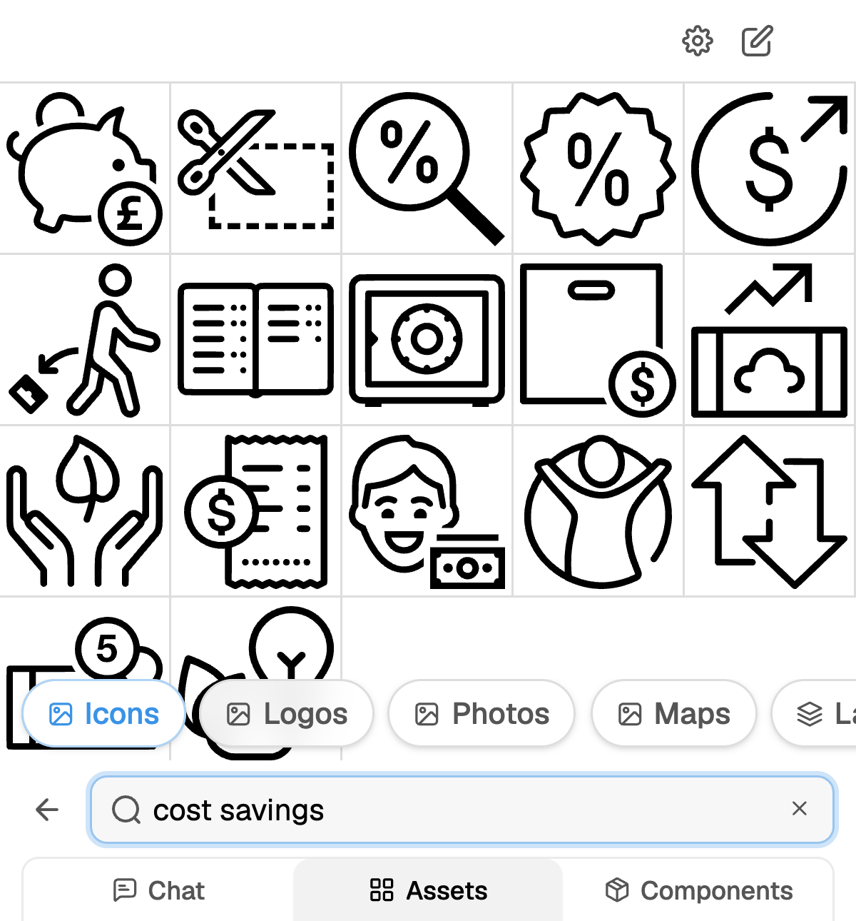
The search is semantic. It matches the concept you describe against the icon index, so you do not
have to guess what a designer named the file.
Icons come in outline, solid and duotone styles. They insert as vectors, recoloured to your master
palette and snapped to the deck grid, so you can select, restyle and resize them like any other
shape.
## Search by meaning, not by filename
The search is semantic. It matches the concept you describe against the icon index, so you do not
have to guess what a designer named the file.
 | Type this | Not this |
| ------------------------ | ---------------------- |
| `cost savings` | `piggy-bank-2` |
| `handover between teams` | `arrows-swap` |
| `regulatory approval` | `checkmark-shield-alt` |
Keep the term short, one to three words. Two focused searches beat one long sentence, because each
term gets its own similarity search.
If nothing fits, describe the *action* rather than the object. "Approve" finds more usable icons
than "stamp".
## Inserting
Each result has two actions:
* **Add to chat** hands the icon to the agent for your next message, and returns you to **Chat**.
* **Add to presentation** drops it on the current slide. Insert several and they arrange in a
grid.
To replace an icon you already placed, select it on the slide and then insert a different one. It
swaps in place and keeps the original frame, so a row of five icons stays aligned.
## Asking the agent instead
You do not have to open the tab. Ask in chat and the agent runs a **Find icon** step itself:
> Add icons to each of the three columns: one for onboarding, one for activation, one for renewal.
The agent searches each concept separately, so distinct ideas get distinct icons rather than three
variants of the same glyph. It recolours what it finds before insertion, the same as the picker
does.
The icon library holds generic iconography only. Company marks live in
[Logos](/assets/logos).
## Keeping a deck consistent
Outline, solid and duotone do not mix well on the same slide, and rarely across a deck. Decide
early, then filter your eye to that style while browsing. If the agent has already placed a set,
say "keep the same icon style as slide 4" when you ask for more.
An icon that tries to carry two concepts reads as neither. Split it: two icons, or one icon and
a label.
Icons arrive in your theme colours. Hand-picking a hex afterwards is what breaks a deck when the
template changes. If you need emphasis, use a theme accent rather than a custom colour.
Inserted icons are already snapped to the deck grid. When you resize, hold the aspect ratio and
match the neighbouring icons rather than the text next to them.
## Your workspace's own icons
If your workspace has uploaded an icon library of its own, it appears as an extra entry in the
library row next to **Icons** and behaves the same way. A workspace admin adds those from the web
editor.
| Type this | Not this |
| ------------------------ | ---------------------- |
| `cost savings` | `piggy-bank-2` |
| `handover between teams` | `arrows-swap` |
| `regulatory approval` | `checkmark-shield-alt` |
Keep the term short, one to three words. Two focused searches beat one long sentence, because each
term gets its own similarity search.
If nothing fits, describe the *action* rather than the object. "Approve" finds more usable icons
than "stamp".
## Inserting
Each result has two actions:
* **Add to chat** hands the icon to the agent for your next message, and returns you to **Chat**.
* **Add to presentation** drops it on the current slide. Insert several and they arrange in a
grid.
To replace an icon you already placed, select it on the slide and then insert a different one. It
swaps in place and keeps the original frame, so a row of five icons stays aligned.
## Asking the agent instead
You do not have to open the tab. Ask in chat and the agent runs a **Find icon** step itself:
> Add icons to each of the three columns: one for onboarding, one for activation, one for renewal.
The agent searches each concept separately, so distinct ideas get distinct icons rather than three
variants of the same glyph. It recolours what it finds before insertion, the same as the picker
does.
The icon library holds generic iconography only. Company marks live in
[Logos](/assets/logos).
## Keeping a deck consistent
Outline, solid and duotone do not mix well on the same slide, and rarely across a deck. Decide
early, then filter your eye to that style while browsing. If the agent has already placed a set,
say "keep the same icon style as slide 4" when you ask for more.
An icon that tries to carry two concepts reads as neither. Split it: two icons, or one icon and
a label.
Icons arrive in your theme colours. Hand-picking a hex afterwards is what breaks a deck when the
template changes. If you need emphasis, use a theme accent rather than a custom colour.
Inserted icons are already snapped to the deck grid. When you resize, hold the aspect ratio and
match the neighbouring icons rather than the text next to them.
## Your workspace's own icons
If your workspace has uploaded an icon library of its own, it appears as an extra entry in the
library row next to **Icons** and behaves the same way. A workspace admin adds those from the web
editor.